Originally, in the top right hand corner I had written the name 'Elle' twice. However, the second word was hard to see as it went behind the models head and could therefore not be read easily. I have therefore changed the second word into a quotation saying "I say it how it is". I believe this is effective as it gives the audience an insight into the article and will encourage them to read it.
Showing posts with label Double Page Spread. Show all posts
Showing posts with label Double Page Spread. Show all posts
Wednesday, 23 March 2011
Editing double page spread
Monday, 21 March 2011
Making my double page spread
I have started my double page spread by inserting my main image and writing the name of celebrity 'Elle' down the side.
I have then added the black and white images in the top right hand corner but put a grey border round them to make them stand out more. The border colour can be seen in the images, meaning it all links in well.
I have written an interview for the double page spread. Looking at my research I have tried to make it as realistic as possible and have therefore began with a short paragraph in bold, introducing the interview. The questions are also in bold and a grey colour so they are not confused with the answers. I have also made the word 'Elle' smaller so it does not cover the image. In the bottom right hand corner is a circle promoting her new album (a similar feature can be seen on the front cover)
I have added quotes between the interview in pink. These quotes are found in the interview and from research I have found this feature is very common. They break up the interview and are bold to make them stand out and make the text look more interesting and realistic.
I have moved the initial paragraph from the interview above the black and white pictures to make them look more involved in the articel. I have also drawn a text box using the pen tool on photoshop (top picture) which means the text can go around the image which I have moved slightly to the left making it more centred. Without having text to the right of the main image made it look seperate from the rest of the page so I believe this has involved it more.
Sunday, 20 March 2011
Plan for Double Page Spread
Saturday, 19 March 2011
Photographs for double page spread.
On my double Page Spread I have decided to have a main image. I have looked through the pictures I took for this magazine and decided this one would be appropriate:
The picture shows the model holding necklaces and a flower hair clip and I believe it almost looks like an album cover image. The angle of the picture means the models face is the largest part of the image while the necklaces are smaller but still a main feature. They make it unique and different to the previous images I have used which are much plainer. The jumper has a soft, casual look and the basic colours do not clash with the colour in the necklaces being held, making it appropriate. However, I do not want a background behind the model in the image so it will look like she is standing out of the page.
I have edited the image to remove the background and also to emphasise the colour in the necklaces.
I like this feature of 'Now' magazines double page spread so have decided to make my own version, using similar pictures of my model. I will also make the images black and white and smaller than the main one so as not to take over.
Image 1
Image 3
Image 4
I have used these 4 images and cropped them all so only the face can be seen. I have also edited the background so it is grey but smooth and I have then made the images black and white. This is effective as it does not take the focus off the main image but looks elegant and attractive.
This is the final series of pictures which I will put on my double page spread.
Tuesday, 15 March 2011
Double Page Spread Features
From research I have discovered that the double page spreads mainly involve an interview with the celebrity. I have therefore written an interview between a reporter and the girl on my magazine 'Elle' about her career in the music industry.
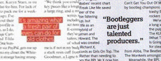
Many magazines I read quote the celebrity in a large, bold font throughout the interview. Here are two examples of this from music magazines:
I have taken phrases from the interview which I will present in this way:
“Rihanna can forget it”
“I aim to get 3 million followers”
These short quotations encourage the audience to read the article and make it look more appealing. As in the examples above, I will write the quotations in a larger font and possibly change the colour to make them stand out.
Looking at features of the Double Page Spread
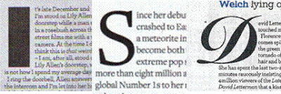
Three of the doube page spreads I researched have made the first letter of eah paragraph a much larger font and the first and third are in different fonts to the rest of the text. This effectively breaks up each paragraph and emphasizes the start of each paragraph. This feature is seen very often in magazine and newspaper articles.
These are the titles of the three magazines that have main titles. Each of them have different fonts. The 'people think' one is very bold and uses a different size text for each letter; as it is quoting the celebtrity, I believe the bold font reflects the celebrities attitude to what she is saying. The other two titles are in more elegant fonts. The 'got the love' title has joined up letters and is quite fancy while the 'Lady Gaga' title writes the first part of the celebrities name in lower case and the second part in capitals. As the second part of her name is the part which identifies her, the magazine has made it the more important part.
Three of the magazines have a short introduction beneath the title which is in a larger/ bolder font than the rest of the text. Each has also highlighted parts of the text in a different colour to emphasize the most important parts.
Double Page Spread Research
This magazine has a very bold, obvious title covering the left hand corner of the page, while the image is on the right hand side. The text takes up the smallest portion of the spread. The spread also has an obvious colour scheme of red, black and white which are shown in the text and and the photograph. Each letter of the title has a black box around it and the letters are different sizes, making it interesting and imaginative. The fact that the title is quoting the celebtrity shows that she well known enough to not have her name ast the title; it also entices the reader to continue reading the page to find out what the story is about. Having little text on the page may encourage certain people to read it if they find a lot of text daunting and this magazine would therefore be appropriate for that type of audience.
This magazine shows similarities to the previous one in the colour shceme used and the arrangement of the image and text - both have large titles, the image across one half and then quite a small amount of text. In this magazine, part of the title of the spread is behind the girl in the image which is effective as it takes up space and makes the page more interesting. In addition, this article does not have the name of the celebrity but a title that links to them (the title 'USA got the love' links to her well-known song).
Once again, there is a clear colour scheme used here of red, white and black and the image covers half the spread. However, the title this time is the celebrities name, without any quotations or sub-headngs. One of the main features of this page is the large red 'L' representing the name 'Lady Gaga'. This effectively tells the audience who the article is about if they do not alredy know. The text on this page covers half the spread, showing there is lot more to talk about than on the previous two spreads. As the text is in black, it can be easily read over the white background and red L.
This spread is slightly different in the way it is arranged. The main image is on the left hand side of the right page, while a smaller series of images goes across the top half of the page. While the main image is in colour, the smaller ones are in black and white so as not to take the focus off the main image. The colour scheme is similar to the previous ones (red, black and white) but the colour blue has also been used to make it more interesting and attractive. The name of the magazine is in the top left hand corner of the page but there is no really obvious main title. The title is below the pictures along the top and uses the colour blue to emphasise parts of it. Beside the main image is a bold paragraph which quotes the celebtity. Below the images along the top are thick black lines which effectively seperate the images from the text on the page.
Subscribe to:
Posts (Atom)


