In what ways does your media products use, develop or challenge forms and conventions of real media products?

I have used four fonts overall. The title and name of the model are in different fonts to the other text on the cover as they are the main, most important parts of the page. Beneath the name of the model ‘Elle’ I have quoted her as this was commonly done on the magazines I researched. The other text is in a range of sizes so make it interesting and show which parts are the mot important.

For the image, I had researched magazines featuring celebrities such as Taylor Swift and Holly Willoughby and therefore wanted to use a similar looking model. The model is doing a casual, quite natural pose which consists of her looking at the camera with her hands in the pockets of her jacket. It therefore shows the magazine is not a really glamorous one but quite relaxed.
In addition, I researched different features of magazines which included a footer across the bottom, either quoting a celebrity or article and consequently decided to make my own but listing singers who feature in the magazine. I have also put the date and price of the magazine in the top right hand corner (on the magazines I researched, the position of the date and price varied so I chose this position as it was empty and looked appropriate). I also put a barcode in the bottom right hand corner of the page to make the magazine look authentic.
On my contents page I have continued with the same colour scheme and range of fonts to make the magazine consistent and show that it is all part of the same magazine. The title of the contents page is in the top right hand corner which differs from the title page; however, I found from research that the title is commonly situated in this position. Down the right hand third, I have made a grey column which lists the articles. The contents list is split into categories which would make it easier for readers to find a certain article; this feature was used in each of the contents pages I researched. The headings of in the grey column are in a bold, eroded font which makes them stand out from the rest of the text; along with the pink box around each heading, they are suceesfully the most obvious part of the column. The names of the articles are then in bold also so they are obvious and clear to read; the short description beneath tells the reader what each article contains.

Furthermore, I have inserted a picture of the magazine front cover in the top right hand corner which, from research, I found is often shown on the contents page. The main image of my contents page is in the bottom left hand corner of the page; I have removed the background to give the impression that the model is coming out of the page; though some of the photographs on the contents pages I researched had whole images, I believed removing the background made the image look more attractive and is the most common way of presenting a picture. I also decided to wirte beneath the title 'contents' a statement about subscribing to the magazine. Many music magazines do this but the way I have written it is slightly different - being under the title it would be seen immediately, rather than being written in the corner or under the contents list which I found from my research. I believe this was the ideal position for it.

My double page spread shows similar characteristics to those on the front cover and contents pages as I have used the same colour scheme throughout and continued with some fonts. The font 'trajan pro' can be seen on each page; on the double page spread I have continued to use it by writing the title 'Elle' as well as the writing in the left hand corner circle. Each of the magazine double page spreads I researched had a main image and most showed the model without the background. I therefore used this research when adding my image. The picture is on the left of the right half of the page, like the magazine I researched. However, I have also added 4 black and white photo's on the left hand page which I based on one of the magazines I had researched.


In contrast to the magazine pictures, my ones are outlined with a grey border. The black and white colour scheme stops them from taking over from the main image but the border makes them quite bold and obvious and links them all together well. Furthermore, I have added a pink circle with information about her album - this links to a similar feature I have used on the front cover, keeping the magazine consistent.
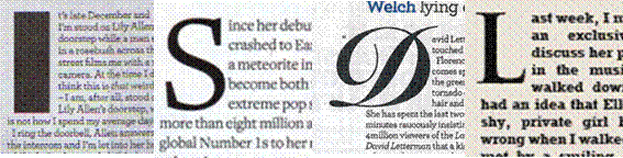
For the text on the page I have written an interview with the celebrity as these are commonly found on double page spreads; though most of the text is found on the left hand page, it continues to the other side of the main image so the text is spread right across the page. The text wraps around the image so it is not in straight columns and therefore uses the space around the image efficiently. The first letter of the interview is in a much larger font than the rest of the text to emphasise the beginning of the paragraph. I found this was used in each of the magazines I researched.
Between the interview I have added quotes from the celebrity. These quotes are found within the interview and encourage the reader to read the article. The quotes are in a larger font and pink colour. The page is otherwise black and white so the pink adds colour to the page, making it more attractive.


At the top of the left hand page, there is a short paragraph introducing the interview. However, unlike the magazines I researched, I have not put it immediately above the interview but instead it is above the black and white photographs as I believe this made the pictures look more involved in the page.
No comments:
Post a Comment