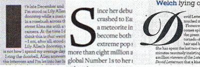
Three of the doube page spreads I researched have made the first letter of eah paragraph a much larger font and the first and third are in different fonts to the rest of the text. This effectively breaks up each paragraph and emphasizes the start of each paragraph. This feature is seen very often in magazine and newspaper articles.
These are the titles of the three magazines that have main titles. Each of them have different fonts. The 'people think' one is very bold and uses a different size text for each letter; as it is quoting the celebtrity, I believe the bold font reflects the celebrities attitude to what she is saying. The other two titles are in more elegant fonts. The 'got the love' title has joined up letters and is quite fancy while the 'Lady Gaga' title writes the first part of the celebrities name in lower case and the second part in capitals. As the second part of her name is the part which identifies her, the magazine has made it the more important part.
Three of the magazines have a short introduction beneath the title which is in a larger/ bolder font than the rest of the text. Each has also highlighted parts of the text in a different colour to emphasize the most important parts.


No comments:
Post a Comment