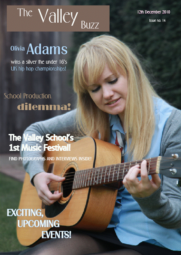
This is my final magazine cover. I have improved it by adding another article title at the bottom of the page looked very empty. Futhermore, I have spaced out each of them so the page does not look too empty. The final article heading at the bottom of the page also uses the blue/brown/white colour scheme so it fits in well.

I have changed my contents contents by introducing more than one layer. The bottom right-hand picture is in a seperate layer which allows the blue line to continue down the page behind it. I have also changed the font colour - instead of the contents list being in black (which was very bold, making the right two thirds look heavier than than left hand third) I have changed it to match the title's background colour. The text in the left hand third is less important and is therefore in a lighter shade of the title background colour. This prevents it from taking over the page but also does not make it look hidden. I also centered all of the text on the page to make it neater, while spacing it out so the bottom of the page does not look empty. In addition, I put one space between each letter in the title so it covers the whoel background box because before there was an empty block of colour.
Your presentation on the blog does not help your argument.
ReplyDeleteI would have preferred to see the development of the contents page from an early stage to finished stage next to each other and development of front page likewise
But I am glad to see that your contents page reflects the planning for it.
ReplyDelete