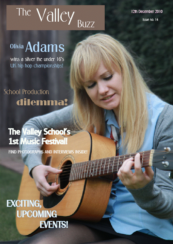
The school magazine I have designed has many traits of a typical magazine, which I had previously researched. On the title page, the heading is in the top left hand corner and goes halfway across the page. However, the cover generally uses the rule of thirds, with all article titles on the left third and the image across the other two. Many school magazines I researched showed images of children working but I decided to take a different approach and show the model playing an instrument; the school uniform means the image is related to a school but the instrument shows that the school has a specific target audience – it is a performing arts school. Three different fonts are used on the title page which is usually the case with magazines but I have also used a range of three colours, all found within the image. Though many magazines use around three colours on the title page, I have edited the fonts so the colours are used in different ways, for example some words are just outlined with colour which I believe challenges conventions of real magazines. On the contents page, I have continued with the same colour scheme to show that the pages link and to keep the magazine consistent. I have used the rule of thirds on the contents page as, from research, I found this is commonly used and so it makes the contents page look realistic. Furthermore, I have a column on the left hand side which is different to the other two because it has information about the making of the magazine, while the other two have a list of the contents of the magazine. This links to my research as the contents pages also have a seperate column but they listed featured articles, rather than information about the making of them, showing how mine had challenged conventions of real media products. In addition, the columns on the magazines I researched were in a different colour to the others to stand out. Although mine is in the same colour, the text colour is different, showing it presents different information to that on the rest of the page. The page is in three columns which I have separated with blue lines; I have used this colour as it is part of the colour scheme and clearly separates the columns. This means the page is organsied well.
2) How does your media product represent particular social groups?My school magazine represents school children as this is its purpose. This is clear on both the title and contents pages as the model is wearing a school uniform. However, the social groups represented are more specific than just school children as the model is playing a guitar, showing the magazine represents people who like music/ performing arts. The colours used on both pages I have made portray the magazine as quite sophisticated, as bright colours would be more appropriate for younger children. The colours therefore represent teenagers, while the fonts used throughout the magazine are quite feminine and sophisticated, linking to the colour scheme. The magazine represents girls more as the model is female, while the fonts used also portray this, however, the colour scheme is not girly and so would represent both girls and boys, showing that the magazine is overalll unisex.
3) What kind of media institution might distribute your media product and why?
One of the main magazine publishers is Bauer Media, which operates in various countries around the world. Not only does Bauer Media publish magazines, but is also involved in TV, radio and online. The business is well known for publishing music magazines such as Kerrang and Q but is also based around celebrity gossip magazines which suggets it is inappropriate for a school magazine. Furthermore, Bauer Media would probably not be interested in a small magazine like 'The Valley' school magazine as they are used to publishing large, well-known ones.
Another company which may be appropriate to publish my school magazine is IPC which is the UK's leading consumer magazine publisher. Unlike Bauer Publisher, IPC is based around publishing hobby and lifestyle magazines which a school magazine would fit into. However, a smaller independent company may be more interested in a small magazine like 'The Valley Buzz' as it has a small target market and is not expected to be sound throughout the entire country. If the company is not well known though, the magazine may not be well known and therefore not be sold. IPC is well known and has a high reputation which suggests 'The Valley Buzz' will do well if published by this company. I would therefore recommend my magazine is published by IPC media.
4) Who would be the audience of your product?
The school magazine clearly targets school children and I believe the image of a girl and the fonts used on the cover would attract girls more. However, the title page and contents page both show the model playing a guitar which narrows the target audience to people who are into music or performing arts. The reason for this is because the school is for performing arts and it is therefore vital for the magazine cover and contents pages to attract the correct audience. The magazine will, however, also appeal to parents of school children as they will be interested in their childs learning environment.
5) How does it attract/ address your auience?
Throughout the front cover, I have used a range of different fonts and text sizes to make the article headings stand out and attract the audience. The colours link in with those seen in the image which are blue and browns mainly; as the colours are not really bright, it looks quite sophisticated and would attract the ideal target market of secondary school aged children and parents. The image shows a girl playing the guitar; by having an instrument on the cover, anyone who is interested in music will be attracted to the cover and engage with it. The contents page continues with this trait, showing a guitar and music sheets which will let the audiene know the school is obviously involved with music. Furthermore, the main titles on the front cover and contents page are bold and obvious and will immediately attract the readers attention. As the title on the front cover is 'The Valley Buzz' it is associated with the The Valley school and will therefore address any pupils at the school or parents with childrent there.
6) What have you learnt about technologies from the process of constructing this product?
During construction of this magazine, I have been introduced to various new computer programmes which have helped me to create my final product. Firstly, I made a Blogger account which meant I could write about my work and any changes I have made. I found it very helpful as it means I can edit my work easily and saves time that would have been spent printing out work. I firstly designed my blog to make it look attractive and I believe this makes all my work look interesting and appealing to read. I have also been introduced to Photoshop which I have used to edit the pictures I have used in my final product. Photoshop has allowed me to make my photographs look more professional and interesting as I can add effects and edit the lighting etc. I have edited the background in the main image on the front cover by making it look dark so make the model stands out. One of the main programmes I have used while making this product is Indesign which I used to put together my title and contents pages. Indesign was quite hard to use at first but I have learnt that it is similar to photoshop in the way layers and tools are used. I believe this has helped me to produce a realistic, professional product.