Monday 31 January 2011

Editing the front Cover

This print screen shot shows how I have changed the circle colour to a pink to match the colour of the text below. The red did not link with any of the colours on the cover and consequently looked out of place. I have also changed the font to match the one below as I believe it suits the style of the magazine more - the previous was bold and became the focus of the magazine. It is now more subtle and sophisticated; it will be more attractive for the target market of this market which is older teenagers/ young adults.

I have then changed the font of the quote beneath the word "elle" to match the one used above. The pervious looked more masculine and had a rocky style to it which is not the music genre this magazine is aimed at.

Saturday 29 January 2011

Making the Front Cover

 After opening an A4 document I cropped the photo to make it fit. I left a larger space on the left hand side so there is room for text. I have also inserted the title 'DECODE' which slightly covers the models head. It does not stop the audience from seeing her face though and is therefore appropriate. As it is not a well-known magazine like 'rolling stone' it cannot go behind her head as the audience would not know what it says.
 I have then added the name 'Elle' which I have chosen as the models name. It is short and easy to remember and therefore would suit a celebrity. In the bottom left hand corner I added a red circle saying 'exclusive interview inside'. The red is bright and attracts the audiences attention. Similar things are often seen on magazines.
 I have added text on the right hand side of the model which states 'Decode's stars of 2011' in a font similar to the title. However, it is in a dark grey colour and much smaller, therefore not taking the attention off the title itself. The number '2011' is bigger than the rest as it is the current year and will atttract the audiences attention. Beneath the models name I have quoted her saying 'My idol is Katy Perry'. However, I later changed the quote as I listed other artists on the cover and do want too many.

 This print screen shows I have deleted the quote and have added text above the word 'Elle'. It says 'Kings of Leon Poster + free album to be won' the word poster is larger and the '+' sign is in a different colour as these parts show the magazine offers posters as well as something else which will encourage people to buy it. Along the bottom is a footer in dark grey saying 'Bruno Mars, Pixie Lott, Taio Cruz' who are all other singers and will be in the magazine. I have chosen them as their music is similar genres and therefore will appeal to the same target audience.

I have added an image of the album which is advertised in the text above do the audience will know exactly what is offered. This also makes the front cover more intersting by adding another image to the one already there. In the top right hand corner is the date and price of the magazine in the same font as in the footer.


Friday 28 January 2011

Plan for Magazine Front Cover

I have drawn and scanned a plan for my magazine front cover which I will be able to refer to while making the cover. It is quite basic but gives me an idea of how I want my final product to turn out.

Thursday 27 January 2011

Edited Photographs

I have edited a few of the photographs I took using photoshop
 

make a gif


Editing Photographs


The original image

I first lassoed the model in the picture using photoshop before making a layer via copying it. I also feathered the image so the model is surrounded by a light outline from the background.
I have then coloured the background a light grey colour. It is simple and does not take the focus off the model herself. However it looks more professional than the sheet which was previously the background.
The original image

I decided to edit the models eyes in this picture to enhance the colour of them, making them more vibrant and attractive. To do so I lassooed each eye and, using the colour balance option, made them bluer.
Finally, I changed the background in this photograph as I did before because I believe it looks more professional and keeps the model as the main focus.

Wednesday 26 January 2011

Second Photoshoot

I have used a different model for these photographs as the first was unavailable.

make avatar
For the first outfit, the model is wearing a black dress with silver necklaces which I believe gives quiet a sophisticated look. However, the dress looks much older than the model herself in these images and gives the wrong vibe. Where she has an innocent face, the dress contrasts making her look older than she is. The dark colour of the dress is quite harsh against her fair hair; a lighter coloured outfit would be more appropriate. One image shows her leaning forward giving her attitude but does not link well with the sophisticated outfit. However the pose where she is holding her neck links well - she looks relaxed and quiet glamorous. The third image shows her face onwards but is quite forced.


These images are similar but close up shots. I believe the first works better. The model looks relaxed with the pose and has an subtle expression, looking content, whereas in the second she appears slightly bored. As the dress is only partially seen, it works much better in these pictures than the previous ones and the pose links well making the model look glamorous.
make a gif
In these images the model is wearing a different outfit which suits her more. This dress is more suitable for a young person as the flowery pattern is quiet innocent. I believe the denim jacket works well with the outfit as it gives a casual image; the model has her hands in the pockets which portrays her as relaxed. In the face on image the models pose appears awkward as she has no expression, however, in the other she looks subtly content and at ease.

In this image the model has another outfit on. The top is made up of neutral colours which ensure the focus is not taken off of her face, while the denim shorts are basic and make the outfit quite casual, linking with the pose. The model is face on and once again has her hands in her pockets which portray her as at ease. The audience can easily see her natural expression which makes her seem quite innocent and young.

In this image the model looks subtly happy and the flower compliments her complexion and also makes her look quite innocent. Furthermore, the jumper is soft and basic which does not take the focus off of the flower. The models eyes are seen clearly here and appear to be looking straight at the audience.


These two images show the model holding a flower and various necklaces in different colours. The objects are a variety of shapes and sized and the bright colours make the photograph more interesting. I believe these images look like one you would find on an album cover. The models face is different in each picture and contrast with many of the previous ones. The first shows the model smiling in a mischievous but subtle way. It contrasts to the previous innocent poses. The left hand image shows her with an expressionless face looking directly into the camera. This means the audience can make their own opinion about her without a pose determining it for them.

This image makes the model appear quite innocent once again, smiling at the camera.

Wednesday 19 January 2011

Looking at magazine layouts


These magazines are both aimed at different target audiences which is shown through the colour, fonts and images used. However, they share some similarities in the way they are layed out. Firstly, the title is shown in the top left hand corner of each magazine but is partly covered by the image. However, this is done because the magazines are well known and so the audience will know which magazine it is without having to read the full title. Across the top of both is a header which provides information about what the magazine contains. It effectively provides another way for the cover to provide information other than listing artciles beside the pictures; both are in different colours which ensures it will attract the audiences attention. Futhermore, both include circles containing information which attract the audiences attention as they are bold, obvious shapes:


The 'sneak' magazine includes an image of a celebrity in the bottom right hand corner which is a taster of the poster inside. This will show the audience exactly what the magazine contains, encouraging them to purchase it.

Sunday 16 January 2011

Photo's


This is a first attempt at taking a picture for my magazine front cover. I have based the look of the model on the images I found in my collage - she has light coloured hair which is slightly wavy and is wearing a simple dress which does not take over the image. However, I believe the smile looks quite forced and not relaxed as I aimed. Furthermore, the models hair needs to be more wavy and the ends must be together more as in this image her hair is spread out at the end.


This image is similar to the one above, however, the expression is more subtle and does not look as forced. In addition, the dark background works well with the models light coloured clothing and hair but there is something red behind her arm which is very obvious and distracts the viewer. However, the dress is screwed up slightly which makes her look scruffy and not elegant as aimed.

Magazine font research

I have researched different fonts which I believe would be ideal for my magazine title.


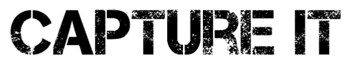
These two fonts are similar in the way that the letters are all capitals and they have an eroded affect. The letteres are also bold which will attract the viewer but the eroded affect makes it more interesting and not just bold black. The style of these fonts would fit well with a rock magazine.


This font is more elegant than the previous fonts; the letters are finer and thinner. The letters are quite curly and surrounding the letters is an eroded style background which makes the font look quite old and mysterious.


Here is another font with an eroded effect. However, the white parts are in the shape of palm leaves which portrays is as Summery. It would therefore go well with a beach style image. However, the letters are easy to read and I believe the palm tree patterns make it very interesting but it may only work with a certain style picture e.g. beachy.

This font is quite different to the previous ones. The letters are less bold and are not eroded. It is quite simple but has a glamourous style which means it would work well with the images I will be using.

This font is mainly lower case except for the first letters of the words 'Action' and 'Time'. It is also bold which makes it easy to read for the viewer. Furthermore, there are white lines in a scratched affect across each letter, making it interesting.

I like the eroded style fonts best because the size and boldness of them are shown in typical magazine fonts, while the eroded characteristics makes it more interesting and unique. I believe the 'beyond wonderland' font does not look very magaziney and looks quite magical and inappropraite. Similarly, the bellerose font has a different style to the others and looks like it would be better suited as a restaurant name font.

My favourite fonts are:
  • Capture it
  • California
  • Action of the Time
So I will use one of these as my magazine title font. Before choosing the final font I will create the title in each of them and decide which is most attractive.


Out of these names I have decided to call my magazine 'decode'. I believe it is an appropriate name as it means to find the meaning of something, which magazines do by writing articles about events.

Here is the title 'decode' in each of the different fonts:

The first two fonts are the same but the background and font colour has been reversed. Each of these fonts looks effective being in black and white. However, I believe the california font (third down) is hard to read as the palm tree shapes replace gaps in the letters; this makes the name of the magazine hard to read. The fourth font is easy to read but can only be written in lower case letters which looks less sophisticated than the first two. I believe the fourth font would consequently appeal to a younger audience and if it wasn't for the eroded affect, it may be seen on a childrens magazine. Therefore, I will use the font 'capture it'.

The font with the background, however, will mean it cannot go across the image as it will block out anything behind. I therefore believe the first font will be most appropriate.

My magazine font