Monday, 28 February 2011

Further Research

 After researching various contents pages, I have identified certain featuers which are consistent throughout each magazine. I will therefore use these features while designing my own contents page.


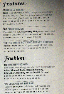
I have cut out the contents list from three of the contents pages. The middle one and right hand one have a main title: 'features' and 'this week', while the two end ones have sub-headings. The left cutting has two headings: 'features' and 'fashion' while the right hand one has 9 sub-headings, seperating the articles more thoroughly in certain categories. All 3 sections show that the articles are listed with the page number on the left hand side. The two left hand ones have written the name of the article in a bold font, making it the most obvious part and a short description is below. Specific colour schemes can also be seen in each of these contents lists. The left is black, grey and blue. The centre one is red, black and gold and the right one is black and yellow.


Here are the titles of each contents page. The left one is clearly the most irregular but still shows similarites to those on the right of it. The left title and 'Q' title are in very similar fonts which are in white with a black background, making it very bold and obvious. Similarly, the yellow title is in a bold font against a black background. The colour schemes I identified with the contents lists are also shown in the titles, making it consistent and all link together. The left title and yellow one are both situated on the top right hand corner of the page while the other is in the left hand corner. However, all cover half the width of the page and are against the edge of the page, which I will also do.

Monday, 14 February 2011

Contents Page Research

This contents page has an obvious colour scheme which consists of black, white and grey. The simple colours make the contents page look sophisticated and suggest it is aimed at young adult target audience. The word 'contents' is written on 3 seperate lines which is quite irregular but looks intersting and attractive. The page is set out in halves, with all the written infomation on the left hadn side. Having the word contents split up fills up space and means the letters can be big and obvious. The models pose frames the words which makes the parts of the magazine all fit together well. The word 'contents' is a bold font while the headings in black are a fancy, more elegant font.

This contents page links with the previous one in the way there is an obvious colour scheme (black white and red). The page uses the rule of thirds: the left lists the articles in the magazine while the second and third sections contain a picture. Below the image is a music review section. The heading is in a black box in a white font which makes it stand out, while the sub-headings are in similar red boxes. This successfully attracts the reader to the important parts of the page and tells them what that particular section contains. The magazine name 'Q' appears twice on the contents page, in front of main titles so it is constantly obvious what magazine it belongs to.


This magazine title page contrasts to the previous ones because there is a wider range of colour used. The most obvious colours are pink, black and white. However, the pink clashes with the red from the 'NME' logo. The page may have been organised in thirds but this is not completely obvious as the left hand column is much narrower; it lists some articles in the magazine. The main section lists the top 10 features of the magazine and has clearly been designed to attract the readers attention - the numbers are bold black while the writing is in pink, linking with the border colour. There are various circles on the page which include extra information which link with the logo circle.
This magazine has a black, white and yellow colour shceme but the main colour is white which makes up the background. This page is in two halves. The left has 3 images including an image of the front cover. There is also a paragraph of information above. The right hand side has 3 more images as well as a list of articles, making up the contents. The same font is used in the contents as well in the title and quotations above which keeps the page concise. The yellow stands out on the page, attracting the readers attention.

Monday, 7 February 2011

Feedback

During the lesson, we all looked at each others magazine front covers and gave feedback. After my magazine was viewed, I was told that it looked realistic, obeying the rules of thirds. The target audience was believed to be for young people who are into recent music, which is what I aimed for. Futhermore, my magazine is apparently very detailed in terms of lighting and the clothing but does not completely link with my initial research because there was a larger variety of colour and fonts.

I have consequently changed one of the fonts so there are now less on the cover. I have used 2 different fonts as well as an extra for the title and the name 'elle'. I had used the fnot gunplay for the words 'decode's stars of 2011' but have now changed it to starplay to link with other text on the cover.


Further feedback shows that my magazine cover is not as crowded as those I researched and so I have added more text to the cover. In addition I feel that the main title does not link with the style of the magazine as it makes it look more masculine, contrasting to the other text on the page. I have therefore made the font 'trajan pro' which links with some of the other text on the page.


Finally, I was told that the quotation beneath the name 'Elle' was hard to read as the black font colour blended in with the dark denim jacket in the picture. I tried changing the font colour but found that overall, black stood out the most despite blending in with the background, so I therefore decided to edit the picture behind, making that section of the image lighter to the text in front could be seen clearer.


The final design for my making front cover


This is the final design for my magazine front cover